

Lloyds Banking Group – branding
Lloyds Banking Group was formed by the merger of HBOS and Lloyds TSB. This happened during a period of crisis in the banking sector. It felt timely to look back
and to reconnect with banking of old, a time when offering deep and lasting financial relationships was the norm.
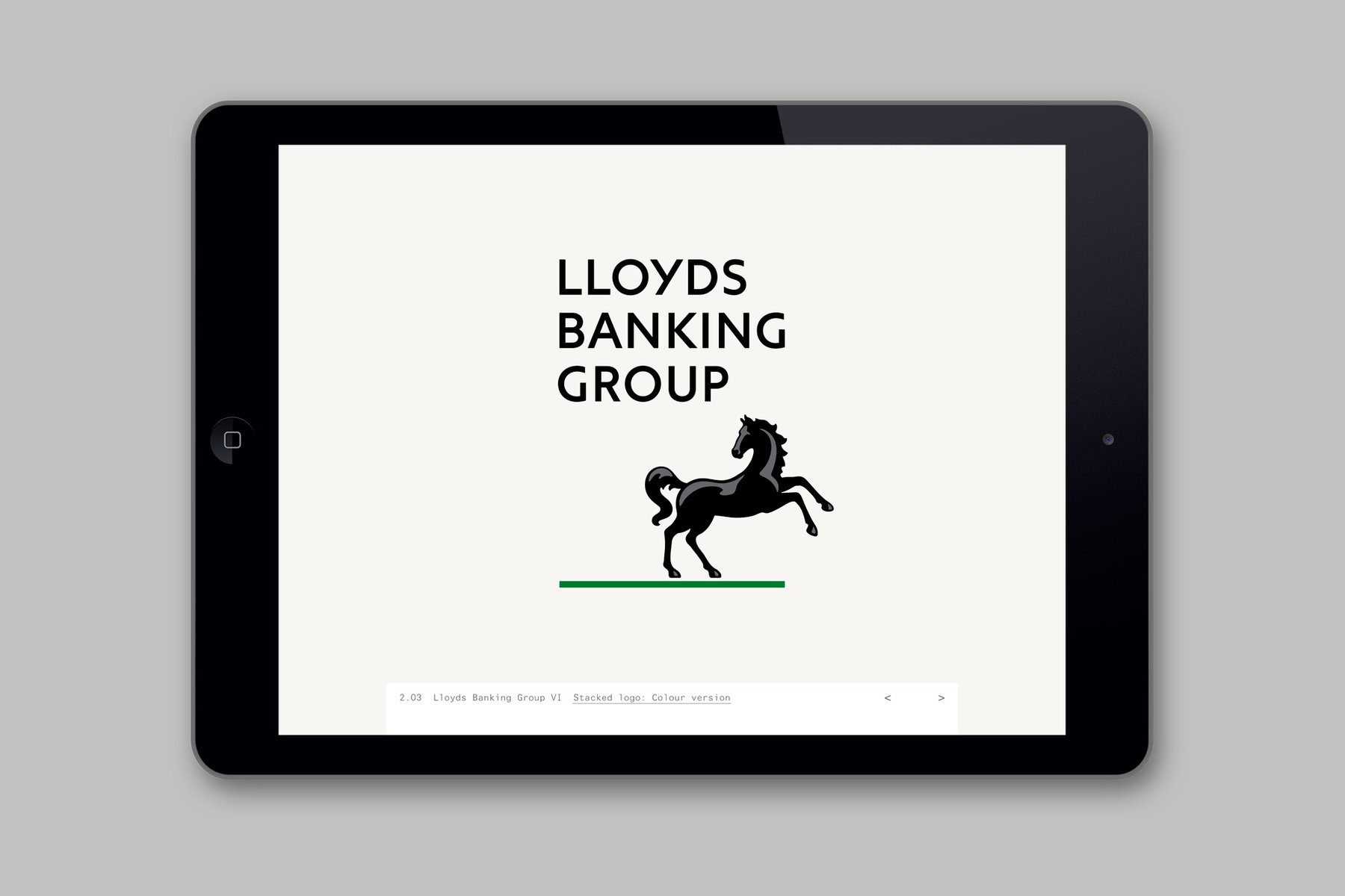
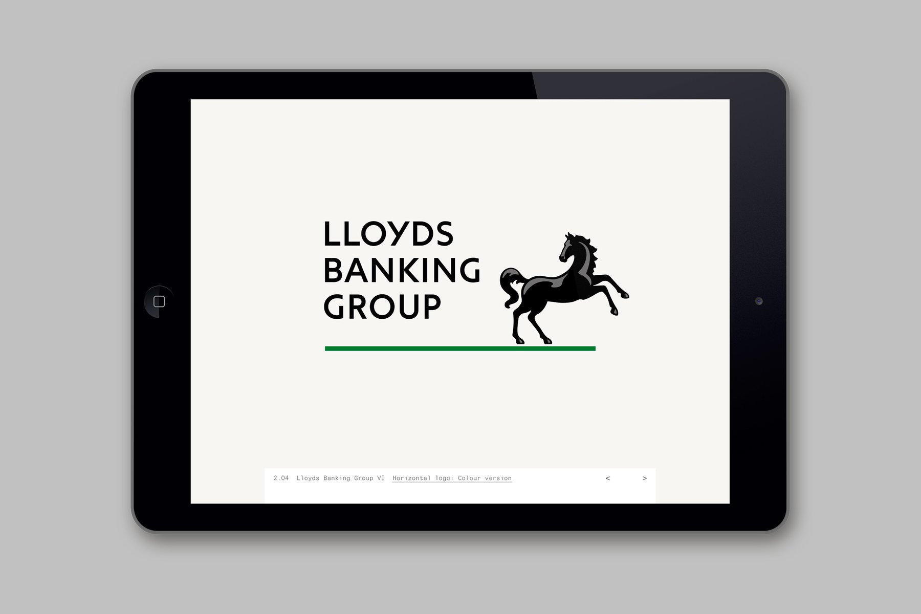
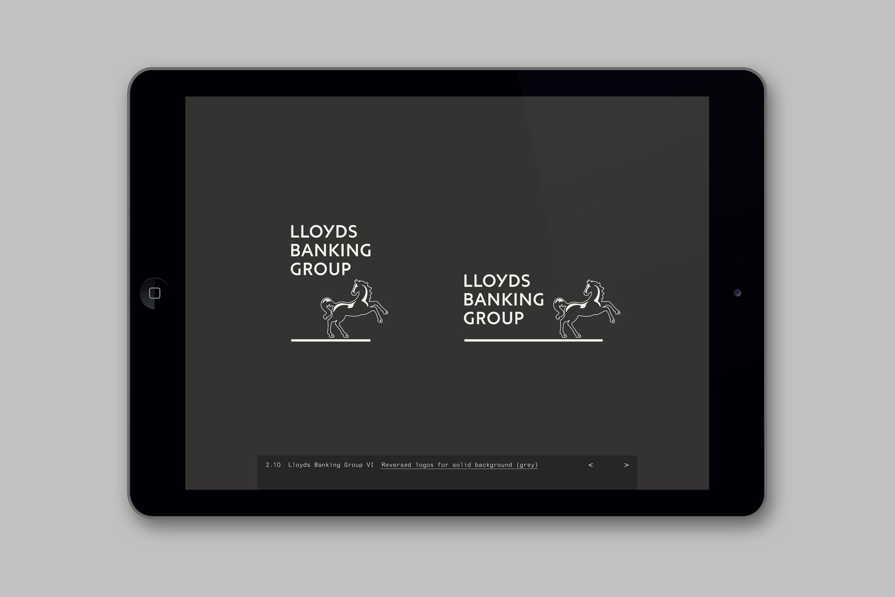
The black horse had long been the symbol of Lloyds Bank. Like many banking signs and symbols, it was inherited from goldsmiths – the forerunners of modern banks. It was originally the symbol of Lombard Street goldsmith, John Bland and dates back to 1728. This firm later became Barnetts, Hoares, Hanbury & Lloyd and was taken over by Lloyds Bank in 1884 when the horse was adopted as their symbol.
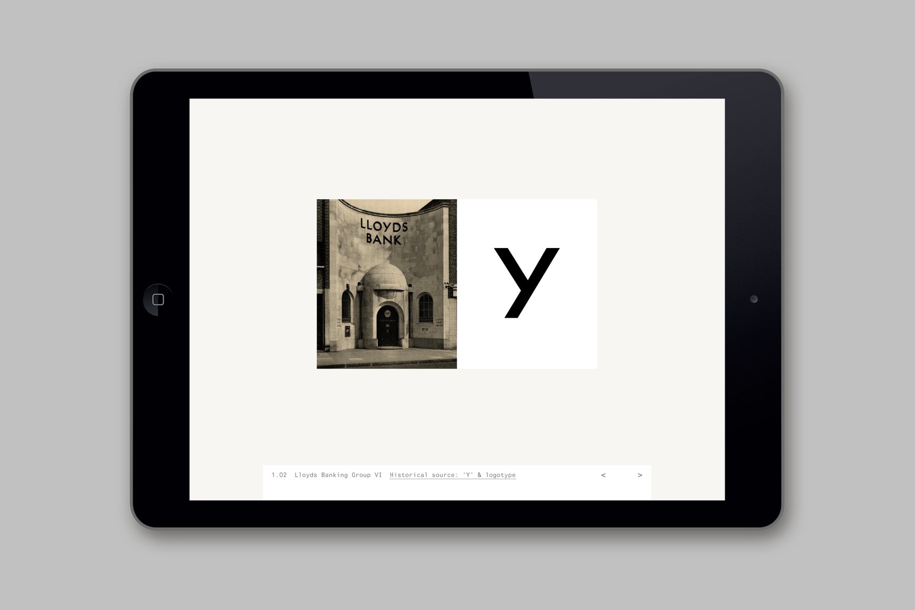
A 1929 photograph from the Lloyds archive was the starting point for the new logotype. In particular the signs distinctive 'Y'.
Creative Directors: Martin Brown and Brian Boylan
Design: Miles Newlyn
Agency: Wolff Olins
and to reconnect with banking of old, a time when offering deep and lasting financial relationships was the norm.
The black horse had long been the symbol of Lloyds Bank. Like many banking signs and symbols, it was inherited from goldsmiths – the forerunners of modern banks. It was originally the symbol of Lombard Street goldsmith, John Bland and dates back to 1728. This firm later became Barnetts, Hoares, Hanbury & Lloyd and was taken over by Lloyds Bank in 1884 when the horse was adopted as their symbol.
A 1929 photograph from the Lloyds archive was the starting point for the new logotype. In particular the signs distinctive 'Y'.
Creative Directors: Martin Brown and Brian Boylan
Design: Miles Newlyn
Agency: Wolff Olins